 32fde139bc
fix https://github.com/flutter/flutter/issues/117722 ### Description 1. Fix the divider doesn't stretch to take all the available width in the scrollable tab bar in M3 2. Add `dividerHeight` property. 3. Update the default tab alignment for the scrollable tab bar to match the specs (this is backward compatible for M2 with the new `tabAlignment` property). ### Bug (default tab alignment) 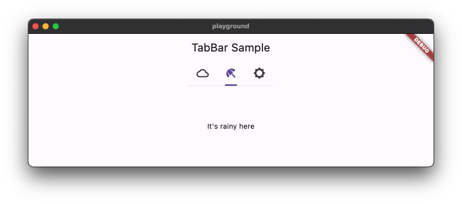 ### Fix (default tab alignment) 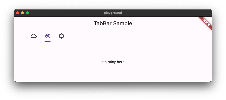 ### Code sample <details> <summary>code sample</summary> ```dart import 'package:flutter/material.dart'; /// Flutter code sample for [TabBar]. void main() => runApp(const TabBarApp()); class TabBarApp extends StatelessWidget { const TabBarApp({super.key}); @override Widget build(BuildContext context) { return MaterialApp( theme: ThemeData( // tabBarTheme: const TabBarTheme(tabAlignment: TabAlignment.start), useMaterial3: true, ), home: const TabBarExample(), ); } } class TabBarExample extends StatefulWidget { const TabBarExample({super.key}); @override State<TabBarExample> createState() => _TabBarExampleState(); } class _TabBarExampleState extends State<TabBarExample> { bool rtl = false; @override Widget build(BuildContext context) { return DefaultTabController( initialIndex: 1, length: 3, child: Directionality( textDirection: rtl ? TextDirection.rtl : TextDirection.ltr, child: Scaffold( appBar: AppBar( title: const Text('TabBar Sample'), ), body: const Column( children: <Widget>[ Text('Scrollable-TabAlignment.start'), TabBar( isScrollable: true, tabAlignment: TabAlignment.start, tabs: <Widget>[ Tab( icon: Icon(Icons.cloud_outlined), ), Tab( icon: Icon(Icons.beach_access_sharp), ), Tab( icon: Icon(Icons.brightness_5_sharp), ), ], ), Text('Scrollable-TabAlignment.startOffset'), TabBar( isScrollable: true, tabAlignment: TabAlignment.startOffset, tabs: <Widget>[ Tab( icon: Icon(Icons.cloud_outlined), ), Tab( icon: Icon(Icons.beach_access_sharp), ), Tab( icon: Icon(Icons.brightness_5_sharp), ), ], ), Text('Scrollable-TabAlignment.center'), TabBar( isScrollable: true, tabAlignment: TabAlignment.center, tabs: <Widget>[ Tab( icon: Icon(Icons.cloud_outlined), ), Tab( icon: Icon(Icons.beach_access_sharp), ), Tab( icon: Icon(Icons.brightness_5_sharp), ), ], ), Spacer(), Text('Non-scrollable-TabAlignment.fill'), TabBar( tabAlignment: TabAlignment.fill, tabs: <Widget>[ Tab( icon: Icon(Icons.cloud_outlined), ), Tab( icon: Icon(Icons.beach_access_sharp), ), Tab( icon: Icon(Icons.brightness_5_sharp), ), ], ), Text('Non-scrollable-TabAlignment.center'), TabBar( tabAlignment: TabAlignment.center, tabs: <Widget>[ Tab( icon: Icon(Icons.cloud_outlined), ), Tab( icon: Icon(Icons.beach_access_sharp), ), Tab( icon: Icon(Icons.brightness_5_sharp), ), ], ), Spacer(), ], ), floatingActionButton: FloatingActionButton.extended( onPressed: () { setState(() { rtl = !rtl; }); }, label: const Text('Switch Direction'), icon: const Icon(Icons.swap_horiz), ), ), ), ); } } ``` </details> 
149 lines
5.6 KiB
Dart
149 lines
5.6 KiB
Dart
// Copyright 2014 The Flutter Authors. All rights reserved.
|
|
// Use of this source code is governed by a BSD-style license that can be
|
|
// found in the LICENSE file.
|
|
|
|
import 'template.dart';
|
|
|
|
class TabsTemplate extends TokenTemplate {
|
|
const TabsTemplate(super.blockName, super.fileName, super.tokens, {
|
|
super.colorSchemePrefix = '_colors.',
|
|
super.textThemePrefix = '_textTheme.',
|
|
});
|
|
|
|
@override
|
|
String generate() => '''
|
|
class _${blockName}PrimaryDefaultsM3 extends TabBarTheme {
|
|
_${blockName}PrimaryDefaultsM3(this.context, this.isScrollable)
|
|
: super(indicatorSize: TabBarIndicatorSize.label);
|
|
|
|
final BuildContext context;
|
|
late final ColorScheme _colors = Theme.of(context).colorScheme;
|
|
late final TextTheme _textTheme = Theme.of(context).textTheme;
|
|
final bool isScrollable;
|
|
|
|
@override
|
|
Color? get dividerColor => ${componentColor("md.comp.primary-navigation-tab.divider")};
|
|
|
|
@override
|
|
double? get dividerHeight => ${getToken('md.comp.primary-navigation-tab.divider.height')};
|
|
|
|
@override
|
|
Color? get indicatorColor => ${componentColor("md.comp.primary-navigation-tab.active-indicator")};
|
|
|
|
@override
|
|
Color? get labelColor => ${componentColor("md.comp.primary-navigation-tab.with-label-text.active.label-text")};
|
|
|
|
@override
|
|
TextStyle? get labelStyle => ${textStyle("md.comp.primary-navigation-tab.with-label-text.label-text")};
|
|
|
|
@override
|
|
Color? get unselectedLabelColor => ${componentColor("md.comp.primary-navigation-tab.with-label-text.inactive.label-text")};
|
|
|
|
@override
|
|
TextStyle? get unselectedLabelStyle => ${textStyle("md.comp.primary-navigation-tab.with-label-text.label-text")};
|
|
|
|
@override
|
|
MaterialStateProperty<Color?> get overlayColor {
|
|
return MaterialStateProperty.resolveWith((Set<MaterialState> states) {
|
|
if (states.contains(MaterialState.selected)) {
|
|
if (states.contains(MaterialState.pressed)) {
|
|
return ${componentColor('md.comp.primary-navigation-tab.active.pressed.state-layer')};
|
|
}
|
|
if (states.contains(MaterialState.hovered)) {
|
|
return ${componentColor('md.comp.primary-navigation-tab.active.hover.state-layer')};
|
|
}
|
|
if (states.contains(MaterialState.focused)) {
|
|
return ${componentColor('md.comp.primary-navigation-tab.active.focus.state-layer')};
|
|
}
|
|
return null;
|
|
}
|
|
if (states.contains(MaterialState.pressed)) {
|
|
return ${componentColor('md.comp.primary-navigation-tab.inactive.pressed.state-layer')};
|
|
}
|
|
if (states.contains(MaterialState.hovered)) {
|
|
return ${componentColor('md.comp.primary-navigation-tab.inactive.hover.state-layer')};
|
|
}
|
|
if (states.contains(MaterialState.focused)) {
|
|
return ${componentColor('md.comp.primary-navigation-tab.inactive.focus.state-layer')};
|
|
}
|
|
return null;
|
|
});
|
|
}
|
|
|
|
@override
|
|
InteractiveInkFeatureFactory? get splashFactory => Theme.of(context).splashFactory;
|
|
|
|
@override
|
|
TabAlignment? get tabAlignment => isScrollable ? TabAlignment.startOffset : TabAlignment.fill;
|
|
|
|
static double indicatorWeight = ${getToken('md.comp.primary-navigation-tab.active-indicator.height')};
|
|
}
|
|
|
|
class _${blockName}SecondaryDefaultsM3 extends TabBarTheme {
|
|
_${blockName}SecondaryDefaultsM3(this.context, this.isScrollable)
|
|
: super(indicatorSize: TabBarIndicatorSize.tab);
|
|
|
|
final BuildContext context;
|
|
late final ColorScheme _colors = Theme.of(context).colorScheme;
|
|
late final TextTheme _textTheme = Theme.of(context).textTheme;
|
|
final bool isScrollable;
|
|
|
|
@override
|
|
Color? get dividerColor => ${componentColor("md.comp.secondary-navigation-tab.divider")};
|
|
|
|
@override
|
|
double? get dividerHeight => ${getToken('md.comp.secondary-navigation-tab.divider.height')};
|
|
|
|
@override
|
|
Color? get indicatorColor => ${componentColor("md.comp.primary-navigation-tab.active-indicator")};
|
|
|
|
@override
|
|
Color? get labelColor => ${componentColor("md.comp.secondary-navigation-tab.active.label-text")};
|
|
|
|
@override
|
|
TextStyle? get labelStyle => ${textStyle("md.comp.secondary-navigation-tab.label-text")};
|
|
|
|
@override
|
|
Color? get unselectedLabelColor => ${componentColor("md.comp.secondary-navigation-tab.inactive.label-text")};
|
|
|
|
@override
|
|
TextStyle? get unselectedLabelStyle => ${textStyle("md.comp.secondary-navigation-tab.label-text")};
|
|
|
|
@override
|
|
MaterialStateProperty<Color?> get overlayColor {
|
|
return MaterialStateProperty.resolveWith((Set<MaterialState> states) {
|
|
if (states.contains(MaterialState.selected)) {
|
|
if (states.contains(MaterialState.pressed)) {
|
|
return ${componentColor('md.comp.secondary-navigation-tab.pressed.state-layer')};
|
|
}
|
|
if (states.contains(MaterialState.hovered)) {
|
|
return ${componentColor('md.comp.secondary-navigation-tab.hover.state-layer')};
|
|
}
|
|
if (states.contains(MaterialState.focused)) {
|
|
return ${componentColor('md.comp.secondary-navigation-tab.focus.state-layer')};
|
|
}
|
|
return null;
|
|
}
|
|
if (states.contains(MaterialState.pressed)) {
|
|
return ${componentColor('md.comp.secondary-navigation-tab.pressed.state-layer')};
|
|
}
|
|
if (states.contains(MaterialState.hovered)) {
|
|
return ${componentColor('md.comp.secondary-navigation-tab.hover.state-layer')};
|
|
}
|
|
if (states.contains(MaterialState.focused)) {
|
|
return ${componentColor('md.comp.secondary-navigation-tab.focus.state-layer')};
|
|
}
|
|
return null;
|
|
});
|
|
}
|
|
|
|
@override
|
|
InteractiveInkFeatureFactory? get splashFactory => Theme.of(context).splashFactory;
|
|
|
|
@override
|
|
TabAlignment? get tabAlignment => isScrollable ? TabAlignment.startOffset : TabAlignment.fill;
|
|
}
|
|
''';
|
|
|
|
}
|