 9e2d9deb28
Fixes [Proposal to add iconAlignment to
ButtonStyle](https://github.com/flutter/flutter/issues/153350)

### Description

This PR refactors buttons `IconAlignment`, adds to `ButtonStyle` and
`styleFrom` methods. Which makes it possible to customize iconAlignment
same way as icon size and color in the `ButtonStyle`.

### Code sample

<details>
<summary>expand to view the code sample</summary>

```dart
import 'package:flutter/material.dart';

enum StyleSegment {
  none,
  widgetButtonStyle,
  widgetStyleFrom,
  themeButtonStyle,
  themeStyleFrom
}

void main() => runApp(const MyApp());

class MyApp extends StatefulWidget {
  const MyApp({super.key});

  @override
  State<MyApp> createState() => _MyAppState();
}

class _MyAppState extends State<MyApp> {
  StyleSegment _selectedSegment = StyleSegment.none;

  ThemeData? getThemeStyle() => switch (_selectedSegment) {
        StyleSegment.themeButtonStyle => ThemeData(
            textButtonTheme: const TextButtonThemeData(
              style: ButtonStyle(
                iconAlignment: IconAlignment.end,
              ),
            ),
            elevatedButtonTheme: const ElevatedButtonThemeData(
              style: ButtonStyle(
                iconAlignment: IconAlignment.end,
              ),
            ),
            outlinedButtonTheme: const OutlinedButtonThemeData(
              style: ButtonStyle(
                iconAlignment: IconAlignment.end,
              ),
            ),
            filledButtonTheme: const FilledButtonThemeData(
              style: ButtonStyle(
                iconAlignment: IconAlignment.end,
              ),
            ),
          ),
        StyleSegment.themeStyleFrom => ThemeData(
            textButtonTheme: TextButtonThemeData(
              style: TextButton.styleFrom(
                iconAlignment: IconAlignment.end,
              ),
            ),
            elevatedButtonTheme: const ElevatedButtonThemeData(
              style: ButtonStyle(
                iconAlignment: IconAlignment.end,
              ),
            ),
            outlinedButtonTheme: const OutlinedButtonThemeData(
              style: ButtonStyle(
                iconAlignment: IconAlignment.end,
              ),
            ),
            filledButtonTheme: const FilledButtonThemeData(
              style: ButtonStyle(
                iconAlignment: IconAlignment.end,
              ),
            ),
          ),
        _ => null
      };

  ButtonStyle? getTextButtonStyle() => switch (_selectedSegment) {
        StyleSegment.widgetStyleFrom => TextButton.styleFrom(
            iconAlignment: IconAlignment.end,
          ),
        StyleSegment.widgetButtonStyle => const ButtonStyle(
            iconAlignment: IconAlignment.end,
          ),
        _ => null
      };

  ButtonStyle? getElevatedButtonStyle() => switch (_selectedSegment) {
        StyleSegment.widgetStyleFrom => ElevatedButton.styleFrom(
            iconAlignment: IconAlignment.end,
          ),
        StyleSegment.widgetButtonStyle => const ButtonStyle(
            iconAlignment: IconAlignment.end,
          ),
        _ => null
      };

  ButtonStyle? getOutlinedButtonStyle() => switch (_selectedSegment) {
        StyleSegment.widgetStyleFrom => OutlinedButton.styleFrom(
            iconAlignment: IconAlignment.end,
          ),
        StyleSegment.widgetButtonStyle => const ButtonStyle(
            iconAlignment: IconAlignment.end,
          ),
        _ => null
      };

  ButtonStyle? getFilledButtonStyle() => switch (_selectedSegment) {
        StyleSegment.widgetStyleFrom => FilledButton.styleFrom(
            iconAlignment: IconAlignment.end,
          ),
        StyleSegment.widgetButtonStyle => const ButtonStyle(
            iconAlignment: IconAlignment.end,
          ),
        _ => null
      };

  @override
  Widget build(BuildContext context) {
    return MaterialApp(
      debugShowCheckedModeBanner: false,
      theme: getThemeStyle(),
      home: Scaffold(
        appBar: AppBar(
          title: const Text('ButtonStyle Icon Alignment'),
        ),
        body: Center(
          child: Padding(
            padding: const EdgeInsets.all(16.0),
            child: Column(
              mainAxisAlignment: MainAxisAlignment.center,
              spacing: 20,
              children: [
                Wrap(
                  spacing: 16,
                  runSpacing: 16,
                  children: [
                    TextButton.icon(
                      style: getTextButtonStyle(),
                      onPressed: () {},
                      icon: const Icon(Icons.add),
                      label: const Text('Text Button'),
                    ),
                    ElevatedButton.icon(
                      style: getElevatedButtonStyle(),
                      onPressed: () {},
                      icon: const Icon(Icons.add),
                      label: const Text('Elevated Button'),
                    ),
                    OutlinedButton.icon(
                      style: getOutlinedButtonStyle(),
                      onPressed: () {},
                      icon: const Icon(Icons.add),
                      label: const Text('Outlined Button'),
                    ),
                    FilledButton.icon(
                      style: getFilledButtonStyle(),
                      onPressed: () {},
                      icon: const Icon(Icons.add),
                      label: const Text('Filled Button'),
                    ),
                    FilledButton.tonalIcon(
                      style: getFilledButtonStyle(),
                      onPressed: () {},
                      icon: const Icon(Icons.add),
                      label: const Text('Filled Button Tonal Icon'),
                    ),
                  ],
                ),
                StyleSelection(
                  selectedSegment: _selectedSegment,
                  onSegmentSelected: (StyleSegment segment) {
                    setState(() {
                      _selectedSegment = segment;
                    });
                  },
                ),
              ],
            ),
          ),
        ),
      ),
    );
  }
}

class StyleSelection extends StatelessWidget {
  const StyleSelection(
      {super.key,
      this.selectedSegment = StyleSegment.none,
      required this.onSegmentSelected});

  final ValueChanged<StyleSegment> onSegmentSelected;
  final StyleSegment selectedSegment;

  @override
  Widget build(BuildContext context) {
    return SegmentedButton<StyleSegment>(
      segments: const <ButtonSegment<StyleSegment>>[
        ButtonSegment<StyleSegment>(
          value: StyleSegment.none,
          label: Text('None'),
        ),
        ButtonSegment<StyleSegment>(
          value: StyleSegment.widgetButtonStyle,
          label: Text('Widget Button Style'),
        ),
        ButtonSegment<StyleSegment>(
          value: StyleSegment.widgetStyleFrom,
          label: Text('Widget Style From'),
        ),
        ButtonSegment<StyleSegment>(
          value: StyleSegment.themeButtonStyle,
          label: Text('Theme Button Style'),
        ),
        ButtonSegment<StyleSegment>(
          value: StyleSegment.themeStyleFrom,
          label: Text('Theme Style From'),
        ),
      ],
      selected: <StyleSegment>{selectedSegment},
      onSelectionChanged: (Set<StyleSegment> newSelection) {
        onSegmentSelected(newSelection.first);
      },
    );
  }
}
```

</details>

### Preview

<img width="1175" alt="Screenshot 2024-11-12 at 12 10 43"
src="https://github.com/user-attachments/assets/a28207c5-0ef7-41fa-a45c-e9401df897a0">


## Pre-launch Checklist

- [x] I read the [Contributor Guide] and followed the process outlined
there for submitting PRs.
- [x] I read the [Tree Hygiene] wiki page, which explains my
responsibilities.
- [x] I read and followed the [Flutter Style Guide], including [Features
we expect every widget to implement].
- [x] I signed the [CLA].
- [x] I listed at least one issue that this PR fixes in the description
above.
- [x] I updated/added relevant documentation (doc comments with `///`).
- [x] I added new tests to check the change I am making, or this PR is
[test-exempt].
- [ ] I followed the [breaking change policy] and added [Data Driven
Fixes] where supported.
- [x] All existing and new tests are passing.

If you need help, consider asking for advice on the #hackers-new channel
on [Discord].

<!-- Links -->
[Contributor Guide]:
https://github.com/flutter/flutter/blob/main/docs/contributing/Tree-hygiene.md#overview
[Tree Hygiene]:
https://github.com/flutter/flutter/blob/main/docs/contributing/Tree-hygiene.md
[test-exempt]:
https://github.com/flutter/flutter/blob/main/docs/contributing/Tree-hygiene.md#tests
[Flutter Style Guide]:
https://github.com/flutter/flutter/blob/main/docs/contributing/Style-guide-for-Flutter-repo.md
[Features we expect every widget to implement]:
https://github.com/flutter/flutter/blob/main/docs/contributing/Style-guide-for-Flutter-repo.md#features-we-expect-every-widget-to-implement
[CLA]: https://cla.developers.google.com/
[flutter/tests]: https://github.com/flutter/tests
[breaking change policy]:
https://github.com/flutter/flutter/blob/main/docs/contributing/Tree-hygiene.md#handling-breaking-changes
[Discord]:
https://github.com/flutter/flutter/blob/main/docs/contributing/Chat.md
[Data Driven Fixes]:
https://github.com/flutter/flutter/blob/main/docs/contributing/Data-driven-Fixes.md


Flutter is Google's SDK for crafting beautiful, fast user experiences for mobile, web, and desktop from a single codebase. Flutter works with existing code, is used by developers and organizations around the world, and is free and open source.
Documentation
For announcements about new releases, follow the flutter-announce@googlegroups.com mailing list. Our documentation also tracks breaking changes across releases.
Terms of service
The Flutter tool may occasionally download resources from Google servers. By downloading or using the Flutter SDK, you agree to the Google Terms of Service: https://policies.google.com/terms
For example, when installed from GitHub (as opposed to from a prepackaged
archive), the Flutter tool will download the Dart SDK from Google servers
immediately when first run, as it is used to execute the flutter tool itself.
This will also occur when Flutter is upgraded (e.g. by running the flutter upgrade command).
About Flutter
We think Flutter will help you create beautiful, fast apps, with a productive, extensible and open development model, whether you're targeting iOS or Android, web, Windows, macOS, Linux or embedding it as the UI toolkit for a platform of your choice.
Beautiful user experiences
We want to enable designers to deliver their full creative vision without being forced to water it down due to limitations of the underlying framework. Flutter's layered architecture gives you control over every pixel on the screen and its powerful compositing capabilities let you overlay and animate graphics, video, text, and controls without limitation. Flutter includes a full set of widgets that deliver pixel-perfect experiences whether you're building for iOS (Cupertino) or other platforms (Material), along with support for customizing or creating entirely new visual components.
Fast results
Flutter is fast. It's powered by hardware-accelerated 2D graphics libraries like Skia (which underpins Chrome and Android) and Impeller. We architected Flutter to support glitch-free, jank-free graphics at the native speed of your device.
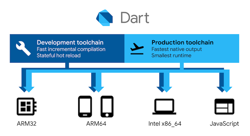
Flutter code is powered by the world-class Dart platform, which enables compilation to 32-bit and 64-bit ARM machine code for iOS and Android, JavaScript and WebAssembly for the web, as well as Intel x64 and ARM for desktop devices.
Productive development
Flutter offers stateful hot reload, allowing you to make changes to your code and see the results instantly without restarting your app or losing its state.

Extensible and open model
Flutter works with any development tool (or none at all), and also includes editor plug-ins for both Visual Studio Code and IntelliJ / Android Studio. Flutter provides tens of thousands of packages to speed your development, regardless of your target platform. And accessing other native code is easy, with support for both FFI (on Android, on iOS, on macOS, and on Windows) as well as platform-specific APIs.
Flutter is a fully open-source project, and we welcome contributions. Information on how to get started can be found in our contributor guide.