 197cd4d665
This PR improves the distance between the label and the icon in the Tab widget. I updated the margin to 2 pixels, taken from the Figma design page for Material 3. On Material 2 I left the default value of 10 pixels. Related to #128696 (In particular, the distance between label and icon) Here are some screenshots for comparison. I looked a bit into the other mentioned issue of the tab height not following the M3 spec. Flutter uses 72 and the spec uses 64. But because Tab is a PreferredSizeWidget, I don't think there is an easy way to provide a different size depending on `ThemeData.useMaterial3`, because there is no `BuildContext` available. I provide a sample image for the 64 height as well for context on the linked issue, even though it's not part of the PR changes. The screenshots are taken side by side with the image at: https://m3.material.io/components/tabs/guidelines ## Original  ## New (tab height = 72, Flutter default for 8 years)  ## New (tab height = 64, M3 spec) 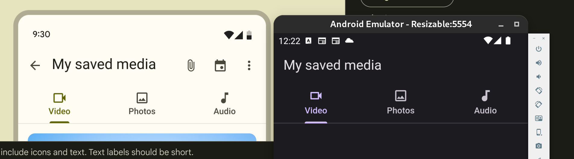
154 lines
5.8 KiB
Dart
154 lines
5.8 KiB
Dart
// Copyright 2014 The Flutter Authors. All rights reserved.
|
|
// Use of this source code is governed by a BSD-style license that can be
|
|
// found in the LICENSE file.
|
|
|
|
import 'template.dart';
|
|
|
|
class TabsTemplate extends TokenTemplate {
|
|
const TabsTemplate(super.blockName, super.fileName, super.tokens, {
|
|
super.colorSchemePrefix = '_colors.',
|
|
super.textThemePrefix = '_textTheme.',
|
|
});
|
|
|
|
@override
|
|
String generate() => '''
|
|
class _${blockName}PrimaryDefaultsM3 extends TabBarTheme {
|
|
_${blockName}PrimaryDefaultsM3(this.context, this.isScrollable)
|
|
: super(indicatorSize: TabBarIndicatorSize.label);
|
|
|
|
final BuildContext context;
|
|
late final ColorScheme _colors = Theme.of(context).colorScheme;
|
|
late final TextTheme _textTheme = Theme.of(context).textTheme;
|
|
final bool isScrollable;
|
|
|
|
@override
|
|
Color? get dividerColor => ${componentColor("md.comp.primary-navigation-tab.divider")};
|
|
|
|
@override
|
|
double? get dividerHeight => ${getToken('md.comp.primary-navigation-tab.divider.height')};
|
|
|
|
@override
|
|
Color? get indicatorColor => ${componentColor("md.comp.primary-navigation-tab.active-indicator")};
|
|
|
|
@override
|
|
Color? get labelColor => ${componentColor("md.comp.primary-navigation-tab.with-label-text.active.label-text")};
|
|
|
|
@override
|
|
TextStyle? get labelStyle => ${textStyle("md.comp.primary-navigation-tab.with-label-text.label-text")};
|
|
|
|
@override
|
|
Color? get unselectedLabelColor => ${componentColor("md.comp.primary-navigation-tab.with-label-text.inactive.label-text")};
|
|
|
|
@override
|
|
TextStyle? get unselectedLabelStyle => ${textStyle("md.comp.primary-navigation-tab.with-label-text.label-text")};
|
|
|
|
@override
|
|
MaterialStateProperty<Color?> get overlayColor {
|
|
return MaterialStateProperty.resolveWith((Set<MaterialState> states) {
|
|
if (states.contains(MaterialState.selected)) {
|
|
if (states.contains(MaterialState.pressed)) {
|
|
return ${componentColor('md.comp.primary-navigation-tab.active.pressed.state-layer')};
|
|
}
|
|
if (states.contains(MaterialState.hovered)) {
|
|
return ${componentColor('md.comp.primary-navigation-tab.active.hover.state-layer')};
|
|
}
|
|
if (states.contains(MaterialState.focused)) {
|
|
return ${componentColor('md.comp.primary-navigation-tab.active.focus.state-layer')};
|
|
}
|
|
return null;
|
|
}
|
|
if (states.contains(MaterialState.pressed)) {
|
|
return ${componentColor('md.comp.primary-navigation-tab.inactive.pressed.state-layer')};
|
|
}
|
|
if (states.contains(MaterialState.hovered)) {
|
|
return ${componentColor('md.comp.primary-navigation-tab.inactive.hover.state-layer')};
|
|
}
|
|
if (states.contains(MaterialState.focused)) {
|
|
return ${componentColor('md.comp.primary-navigation-tab.inactive.focus.state-layer')};
|
|
}
|
|
return null;
|
|
});
|
|
}
|
|
|
|
@override
|
|
InteractiveInkFeatureFactory? get splashFactory => Theme.of(context).splashFactory;
|
|
|
|
@override
|
|
TabAlignment? get tabAlignment => isScrollable ? TabAlignment.startOffset : TabAlignment.fill;
|
|
|
|
static double indicatorWeight = ${getToken('md.comp.primary-navigation-tab.active-indicator.height')};
|
|
|
|
// TODO(davidmartos96): This value doesn't currently exist in
|
|
// https://m3.material.io/components/tabs/specs
|
|
// Update this when the token is available.
|
|
static const EdgeInsetsGeometry iconMargin = EdgeInsets.only(bottom: 2);
|
|
}
|
|
|
|
class _${blockName}SecondaryDefaultsM3 extends TabBarTheme {
|
|
_${blockName}SecondaryDefaultsM3(this.context, this.isScrollable)
|
|
: super(indicatorSize: TabBarIndicatorSize.tab);
|
|
|
|
final BuildContext context;
|
|
late final ColorScheme _colors = Theme.of(context).colorScheme;
|
|
late final TextTheme _textTheme = Theme.of(context).textTheme;
|
|
final bool isScrollable;
|
|
|
|
@override
|
|
Color? get dividerColor => ${componentColor("md.comp.secondary-navigation-tab.divider")};
|
|
|
|
@override
|
|
double? get dividerHeight => ${getToken('md.comp.secondary-navigation-tab.divider.height')};
|
|
|
|
@override
|
|
Color? get indicatorColor => ${componentColor("md.comp.primary-navigation-tab.active-indicator")};
|
|
|
|
@override
|
|
Color? get labelColor => ${componentColor("md.comp.secondary-navigation-tab.active.label-text")};
|
|
|
|
@override
|
|
TextStyle? get labelStyle => ${textStyle("md.comp.secondary-navigation-tab.label-text")};
|
|
|
|
@override
|
|
Color? get unselectedLabelColor => ${componentColor("md.comp.secondary-navigation-tab.inactive.label-text")};
|
|
|
|
@override
|
|
TextStyle? get unselectedLabelStyle => ${textStyle("md.comp.secondary-navigation-tab.label-text")};
|
|
|
|
@override
|
|
MaterialStateProperty<Color?> get overlayColor {
|
|
return MaterialStateProperty.resolveWith((Set<MaterialState> states) {
|
|
if (states.contains(MaterialState.selected)) {
|
|
if (states.contains(MaterialState.pressed)) {
|
|
return ${componentColor('md.comp.secondary-navigation-tab.pressed.state-layer')};
|
|
}
|
|
if (states.contains(MaterialState.hovered)) {
|
|
return ${componentColor('md.comp.secondary-navigation-tab.hover.state-layer')};
|
|
}
|
|
if (states.contains(MaterialState.focused)) {
|
|
return ${componentColor('md.comp.secondary-navigation-tab.focus.state-layer')};
|
|
}
|
|
return null;
|
|
}
|
|
if (states.contains(MaterialState.pressed)) {
|
|
return ${componentColor('md.comp.secondary-navigation-tab.pressed.state-layer')};
|
|
}
|
|
if (states.contains(MaterialState.hovered)) {
|
|
return ${componentColor('md.comp.secondary-navigation-tab.hover.state-layer')};
|
|
}
|
|
if (states.contains(MaterialState.focused)) {
|
|
return ${componentColor('md.comp.secondary-navigation-tab.focus.state-layer')};
|
|
}
|
|
return null;
|
|
});
|
|
}
|
|
|
|
@override
|
|
InteractiveInkFeatureFactory? get splashFactory => Theme.of(context).splashFactory;
|
|
|
|
@override
|
|
TabAlignment? get tabAlignment => isScrollable ? TabAlignment.startOffset : TabAlignment.fill;
|
|
}
|
|
''';
|
|
|
|
}
|